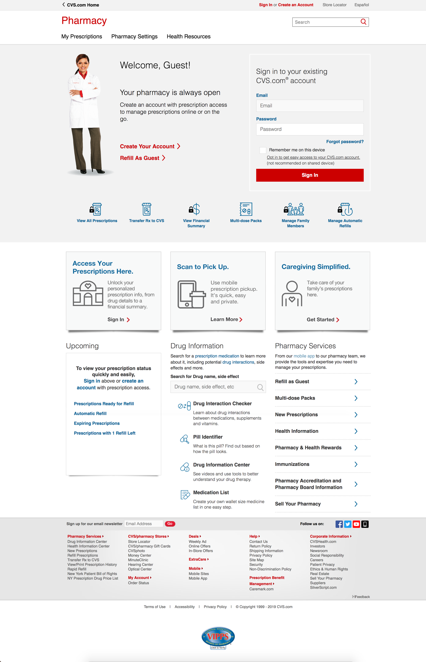
Pharmacy Homepage
(collaborated with Marketing team & 3rd party agency and helped with implementation)
Marketing goal:
Boost customer engagement
Increase of account creation by 15%
Hub of landing pages, micro sites and campaigns
UX Digital team’s goal:
Product & service offering awareness
Streamline unauthenticated & authenticated pages
Set customer up for success with clear navigation, call to action and expectations
Accessibility & compliance and responsiveness/
Pain-point observed and researched by Digital team:
not aligned with Brand, utilitarian look & feel
useful features and tools are under-utilized and presented
see no presence of Marketing campaigns
convoluting navigation and interaction
Involvement:
Collaboration session with stakeholders and teams/ parties involved
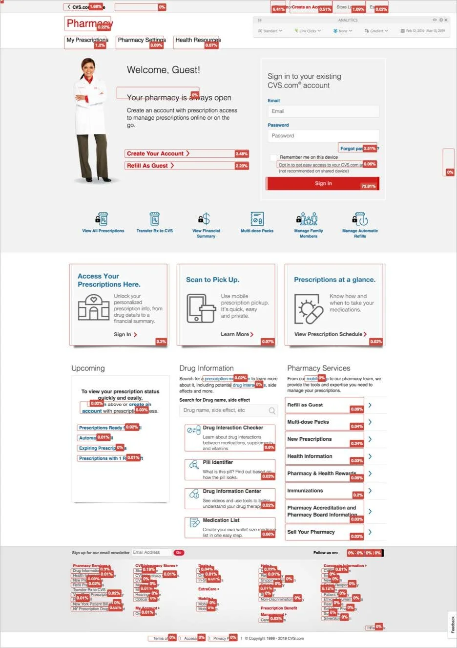
Unmoderated user testing & A/B testing
Research: card-sort, nomenclatural study, tree-test
Brand & copy verbiage alignement
Implementation plan
Cross team coordination & collaboration
User testing feedback:
Users were successful finding and accomplishing the top tasks, using the different ways of finding information:
For top tasks ”front and center,” clickable promo titles, text and horizontal arrows, lower banner CTAs & footer links.
Promo “tile” boxes were helpful at attracting attention
Positive reaction to clean, simple layout; readability (large font and ability to scan quickly) and attractiveness across all designs
Participants were surprised at the range of services offered (e.g. delivery)
Headings and consistent breadcrumb use, primary CTA prominent with clear, next best actions
What’s next?
Optimization on mobile
Not clear how to incentivize non-online CVS customers to use digital services
Promos were used more on desktop than mobile
Secondary landing pages need to be mobile friendly (would also benefit desktop users), with clear
Concept creation by Agency
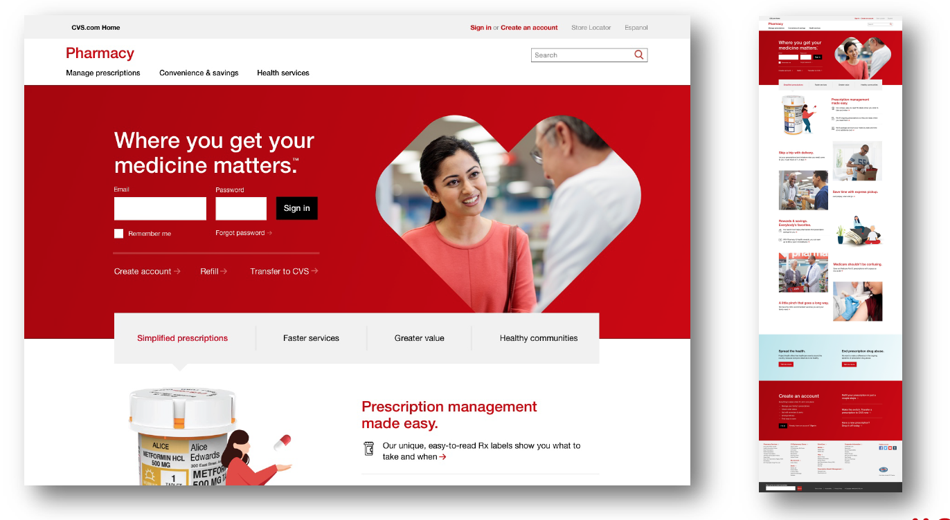
Final implementation
