
Cart & Checkout Redesign
Initiative BackgroundA few years after transitioning off Nike’s platform,
Converse’s cart and checkout experience required a redesign to better meet evolving user expectations and business needs.
Business GoalsIncrease conversion rate
Improve AOV
Improve UPT (was at 1.2-1.5)
Key MetricCheckout completion rate
Droop-off per step
Time to complete
Error rate/recovery
User GoalsClarity & confident in every step of Checkout
Improved site performance speed
Improved checkout speed
Flexibility in payment, edits
Research Findings 👀 🔍Customer Satisfaction & Competitive Positioning
CSAT for cart and checkout was merely at parity with competitors, highlighting clear opportunities for differentiation.
(Resources: Baymard & Salesforce Commerce Cloud)
Conversion Opportunities
Lack of express payment options introduces friction for mobile and impulse users, contributing to cart abandonment—especially in Western Europe.
High guest checkout rates indicated an opportunity for member acquisition.
Cart and checkout were the second-largest touchpoint for sign-in/sign-up, signaling strong conversion intent.
Limited personalization across the journey signals untapped opportunities for upsell and cross-sell.
(Resources: InMoment, Adobe Analytics)
Usability & Experience Gaps
Mobile experience was under-optimized, despite mobile driving the majority of traffic (skewed toward iOS users).
Sub-journeys were not optimized for order completion and frequently divert users from their primary task, i.e.
Member flow lacks efficiency and does not adequately support quick edits to shipping and billing
Product edit often navigates customer away from Checkout
Error recovery rate seemed low and slow around promo code, payment highlighting opportunity for clarity and recommended next best action.
(Resources: InMoment, Adobe Analytics)
UX Do-Now Project Plan
Phase 1Discovery
& Research
Scope
My InvolvementPhase 2Definition
& Prioritization
Synthesize findings into a clear direction(s)
Create a shared, aligned roadmap across UX, Product, Dev and Testing & Optimization teams
↘︎ Partnered with strategists to uncover pain points and define opportunities within key user flows and features Identify opportunity: Do-now & do-later optimizations & testing opportunities ↘︎ Acted as a connective layer across product, engineering, creative, analytics, and research teams to drive alignment in an agile environment Prioritization: Impact vs effort (what to fix first, what will be part of the new design & what to measure now to inform redesign)
Phase 3Implementation, Launch & Measure
Deliver win-now designs for low effort-high impact optimizations in the current experience
Closing the loop with data and continuous monitoring
↘︎ Ensured high-quality design implementation, maintaining consistency and accessibility across platforms
↘︎ Tracked and analyzed engagement and conversion metrics, using insights inform the vision of new experience
Understand current experience, pain points & opportunities
Uncover user’s needs & expectation
↘︎ Directed discovery efforts to identify customer needs and translate insights into intuitive, scalable digital solutions
Data analysis: Funnel drop-offs, device split (mobile vs desktop), error logs, customer feedback
Usability audit: Identify friction in current cart/checkout flow
Competitive benchmarking: Patterns from leading e-commerce checkouts
↘︎ Orchestrated cross-functional design initiatives, aligning user needs with business goals across the Converse ecosystem
Redesign Project Plan
Phase 1Strategy Creation
Scope
My InvolvementPhase 4Visual Design & System Integration
Apply brand and UI system
Ensure accessibility (e.g., WCAG / Section 508)
Translation pressure-test
↘︎ Ensured agency leveraging existing brand & UI pattern.
↘︎ Ensured agency work aligns with existing systems and long-term product direction.
↘︎ Ensured all flows and interactions are well-documented including error state & handling.
Scope
My InvolvementPhase 2Concepting & UX Design
Map out rough current vs future user journey
Define ideal checkout flow (guest checkout, express pay, etc.)
Identify key moments: cart review, shipping, payment, confirmation
Stakeholder share-out & reviews
↘︎ Acted as the gatekeeper of quality and consistency, reviewing outputs, synthesizing stakeholder feedback, and preventing misalignment.
↘︎ Made sure decisions are realistic, scalable, and actually shippable within the organization.
Phase 5Implementation
& Collaboration
Implementation & testing plan creation
↘︎↘︎ Collaborated with product and testing optimization teams for implementation strategy and plan creation.
↘︎ Conducted design QA.
↘︎ Supported design during build (design QA)
Phase 3Prototype & Test
Build interactive prototypes
Conduct usability testing
↘︎ Acted as the gatekeeper of quality and consistency, reviewing outputs, synthesizing stakeholder feedback, and preventing misalignment.
↘︎ Made sure decisions are realistic, scalable, and actually shippable within the organization.
Phase 6Launch
& Measure
Track key metrics (conversion, drop-off, errors)
Gather qualitative feedback
Iterate based on data and feedback
↘︎ Optimized micro-interactions, messaging, and performance
↘︎ Explore future enhancements
↘︎ Tracked and analyzed engagement and conversion metrics, using insights inform iterations
↘︎ Supported post -launch A/B testing
Reimagine the end-to-end experience
Translate strategy into features & functionalities
↘︎ Led UX strategy and design driving capability development and optimization.
↘︎ Provided the agency with deep context—business goals, user insights & technical constraints.
✶ Converse Cart & Checkout Redesign ✶Guiding Principles
↘︎
Simplified Journey
Streamline the flow to reduce cognitive load and decision fatigue.
↘︎
Mobile First Design
Design for the smallest screen first (informed by data), prioritizing clarity and ease of interaction.
↘︎
Frictionless by Default
Reduce effort at every step to keep both guests and members moving forward towards order completion.
↘︎
Clarity Builds Trust
Ensure users feel confident and informed at every step of the checkout process.
See how each US decisions, feature & functionality improvement
ties back to guiding principle in the next section
⇣
↘︎
Beyond Checkout, Connected to Brand
Extend the experience beyond transaction to reinforce brand and build relationships.
↘︎ Mobile-first Design
Simplified layouts
Responsive designs
Thumb-friendly actions
Consider sticky CTAs
↘︎ Clarity Builds Trust
Promo eligibility clarity
↘︎ Beyond Checkout, Connected to Brand
On-brand microcopy, visuals and animation
Cross-sell/upsell aligned with brand
Re-Design: Cart 🛒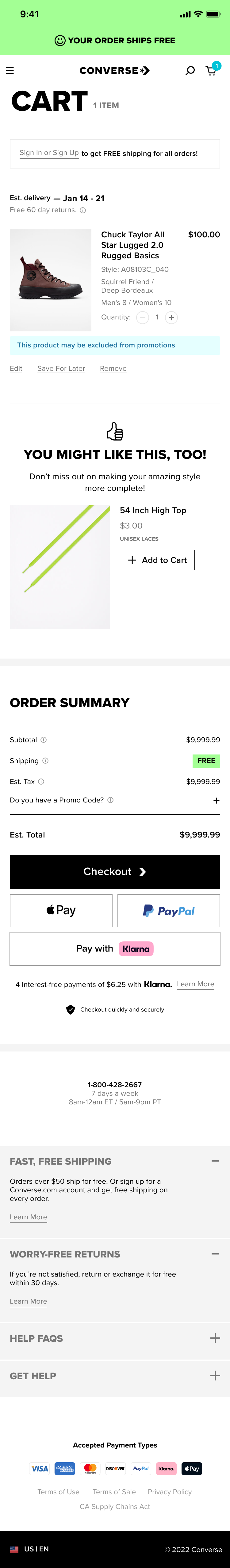
↘︎ Clarity Builds Trust
Transparent pricing (tax, shipping, fees)
Clear delivery expectations
Visible return policies
↘︎ Frictionless by Default
Express payments (Apple Pay, PayPal, Klarna)
↘︎ Simplified Journey
Clear progress indicators
Persistent cart summary
Focused content hierarchy
Contextual acquisition & subscription
Clear guiding copy on CTA
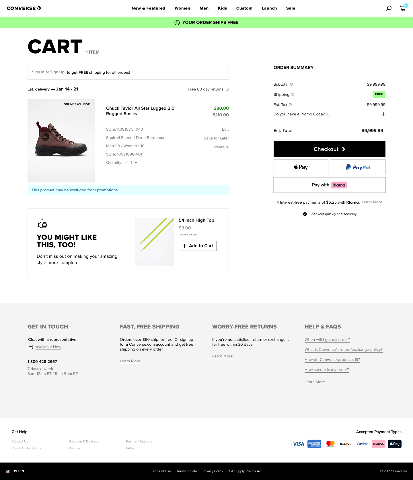
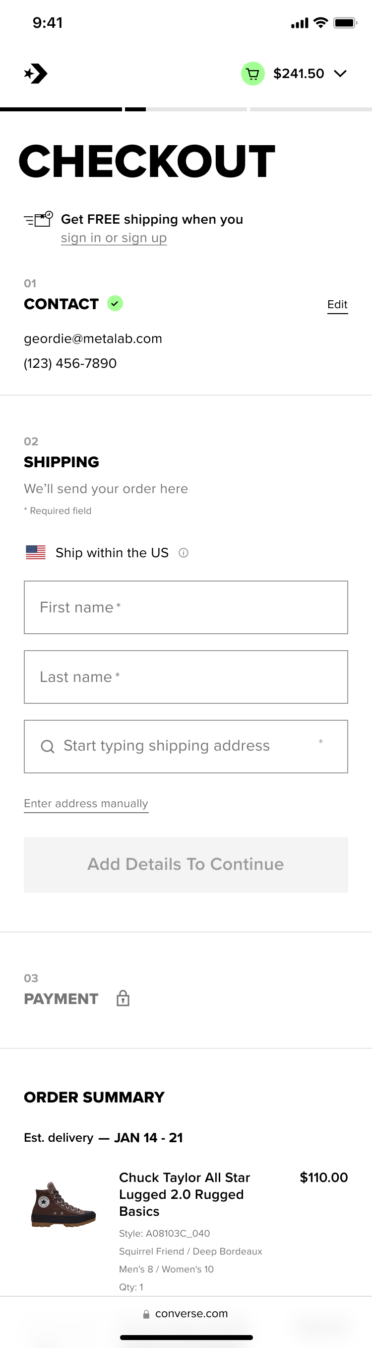
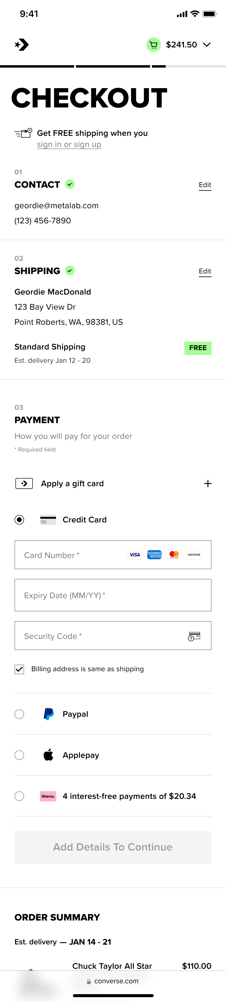
Re-Design:Checkout/ Contact Step 📞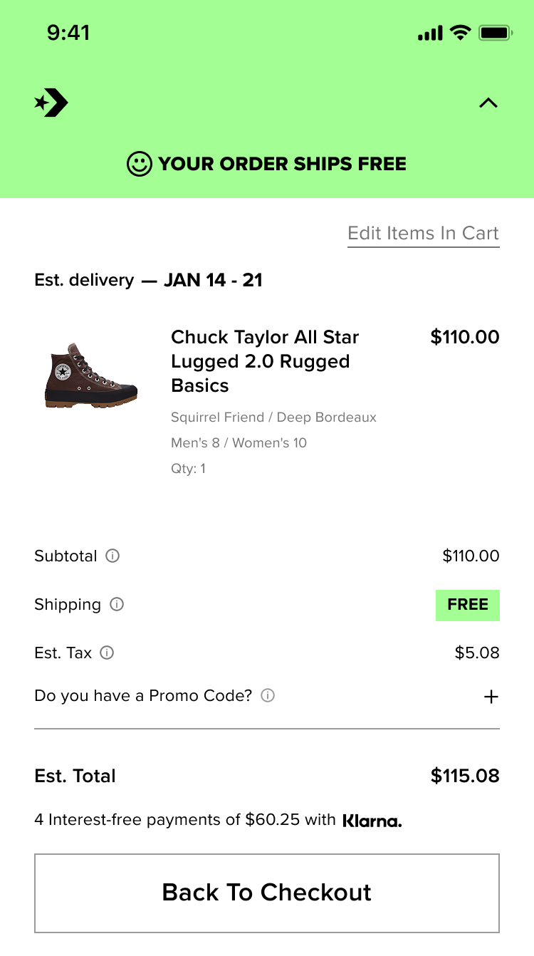
↘︎ Mobile-first Design
Persistent Cart Summary
Thumb-friendly actions
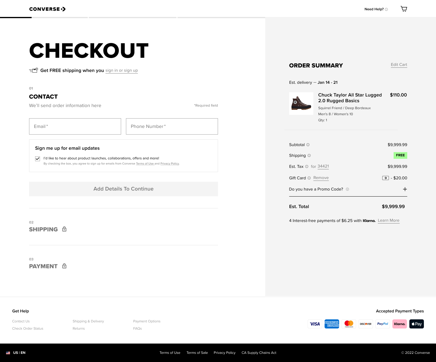
↘︎ Clarity Builds Trust
Transparent pricing (tax, shipping, fees)
Clear delivery expectations
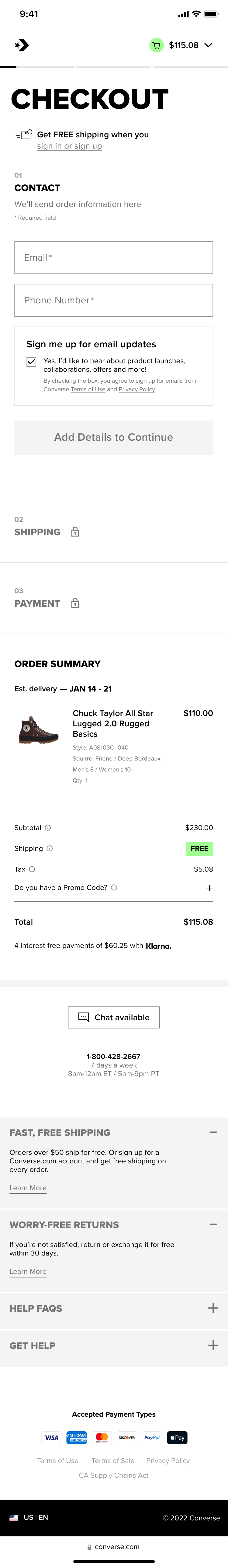
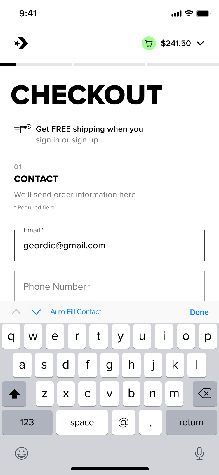
The screens to the right demonstrate how thoughtful error handling
and interactions were designed to reduce friction, build trust, and support a seamless checkout experience. 🤌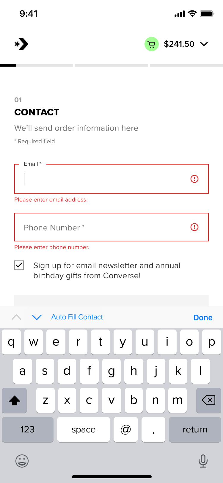
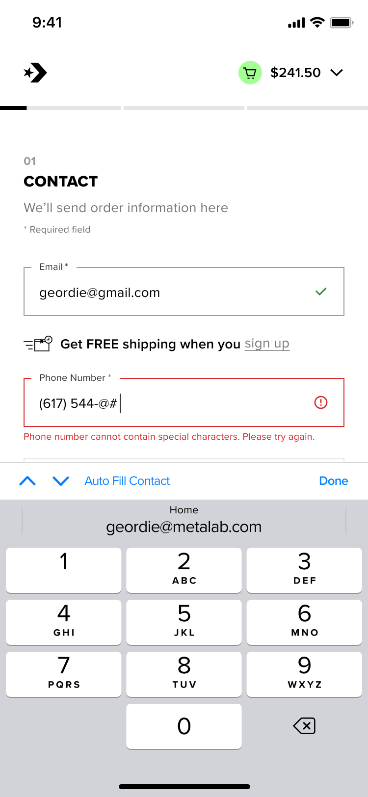
↘︎ When user engages with CTA before inputing, error will show with clear guidance
↘︎ Corresponding keyboard will show depending on what field user engages with
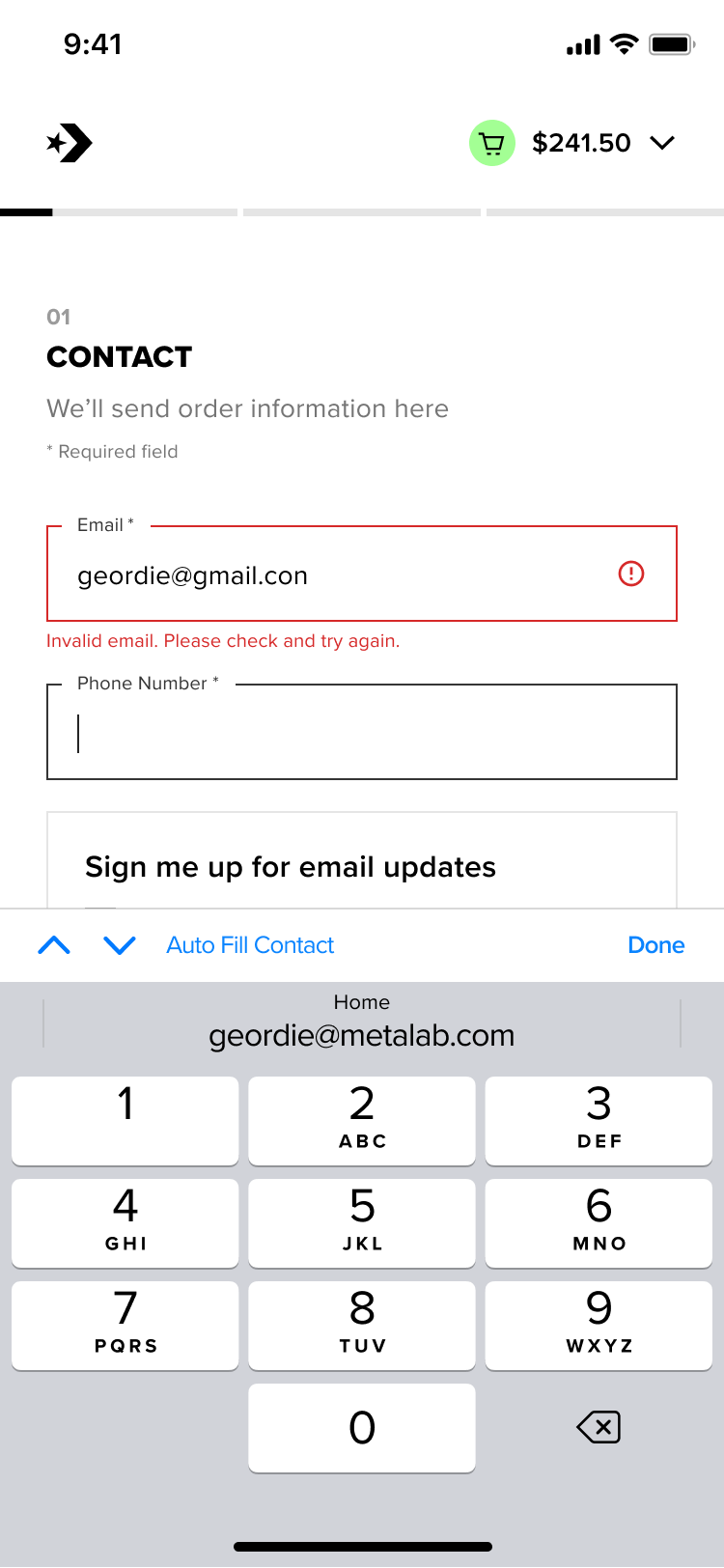
↘︎ Numeric keyboard will be defaulted to form fields like Phone Number, Zip Code, Credit Card, Expiration Date & CVV
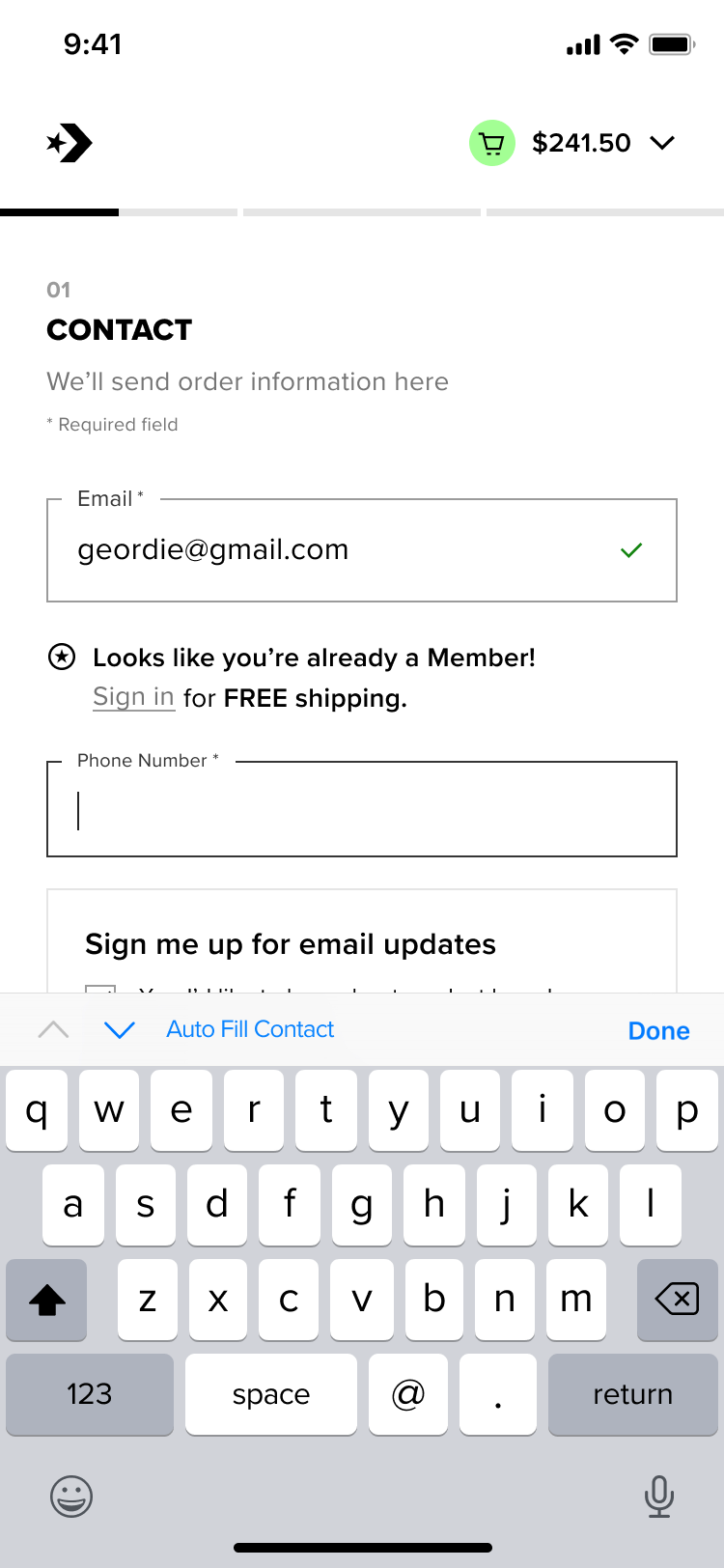
↘︎ Member e-mail recognized, nudging user to sign in for free shipping & faster checkout experience
↘︎ Guest e-mail recognized, nudging user to sign up for free shipping on all orders
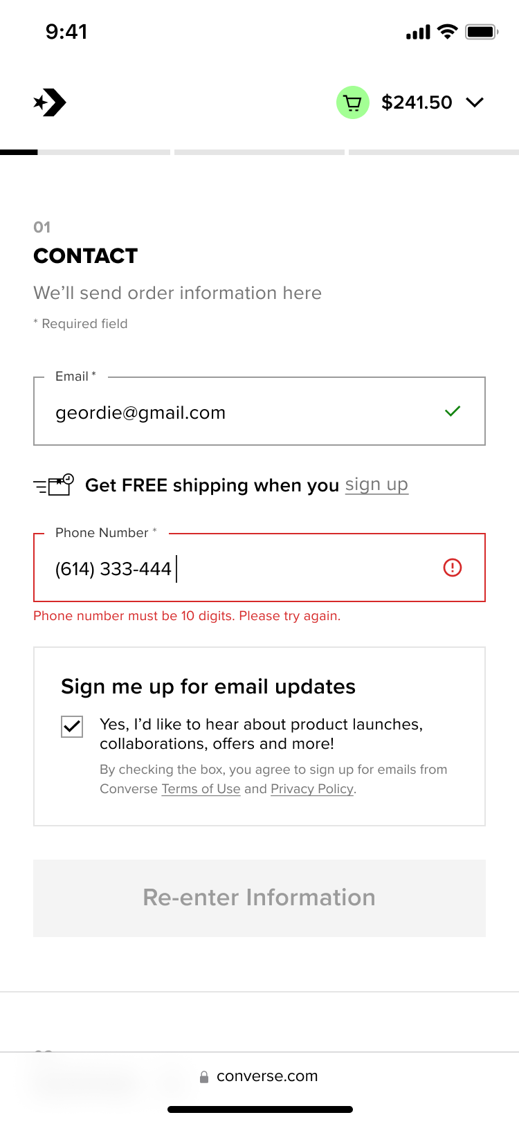
↘︎ Inline validation with clear messaging below form-field as well CTA on what happened and how to recovery from it
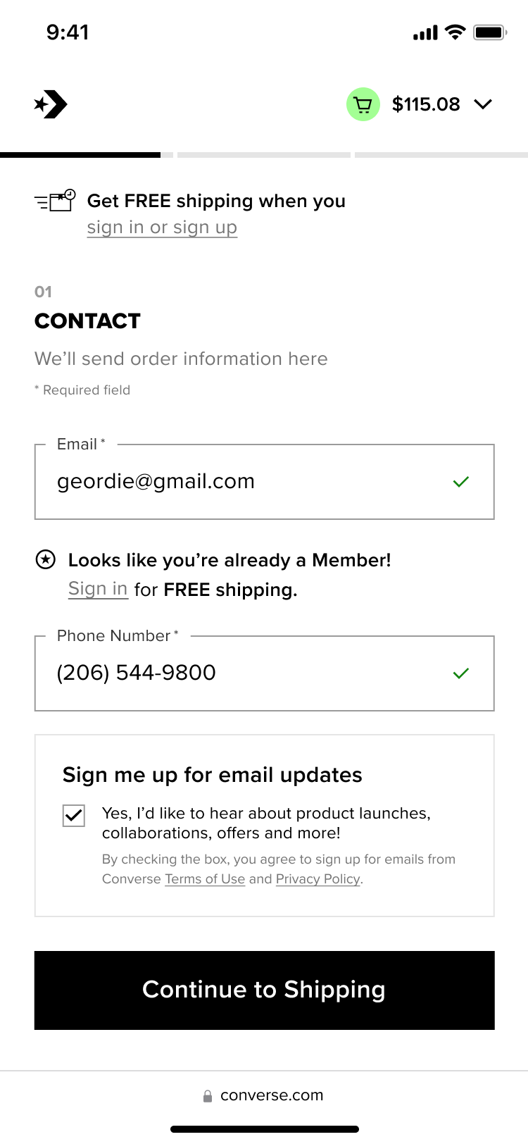
Validated state ✅
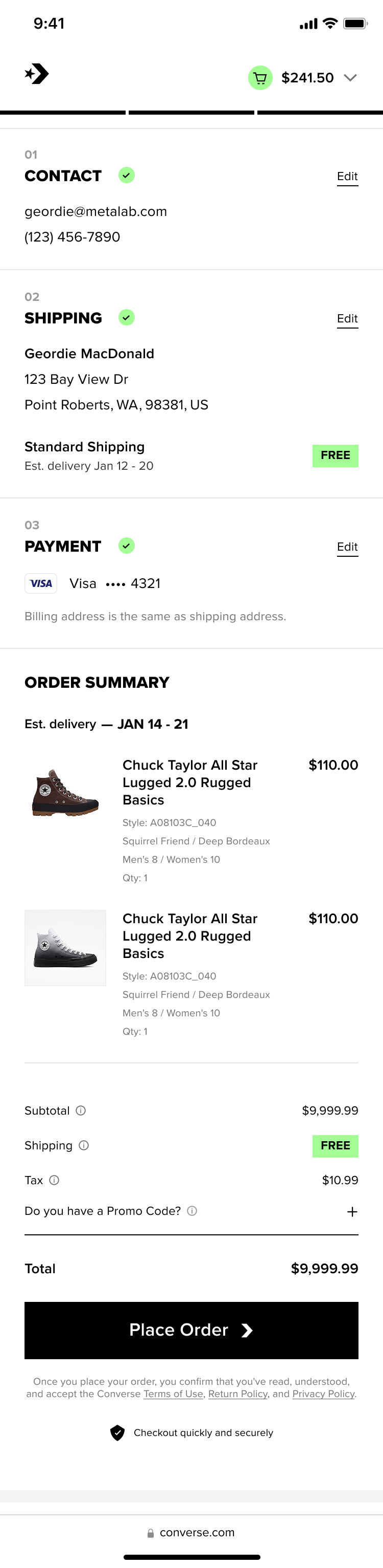
↘︎ Clarity Builds Trust
Summary view of entered info for easy review
↘︎ Frictionless by Default
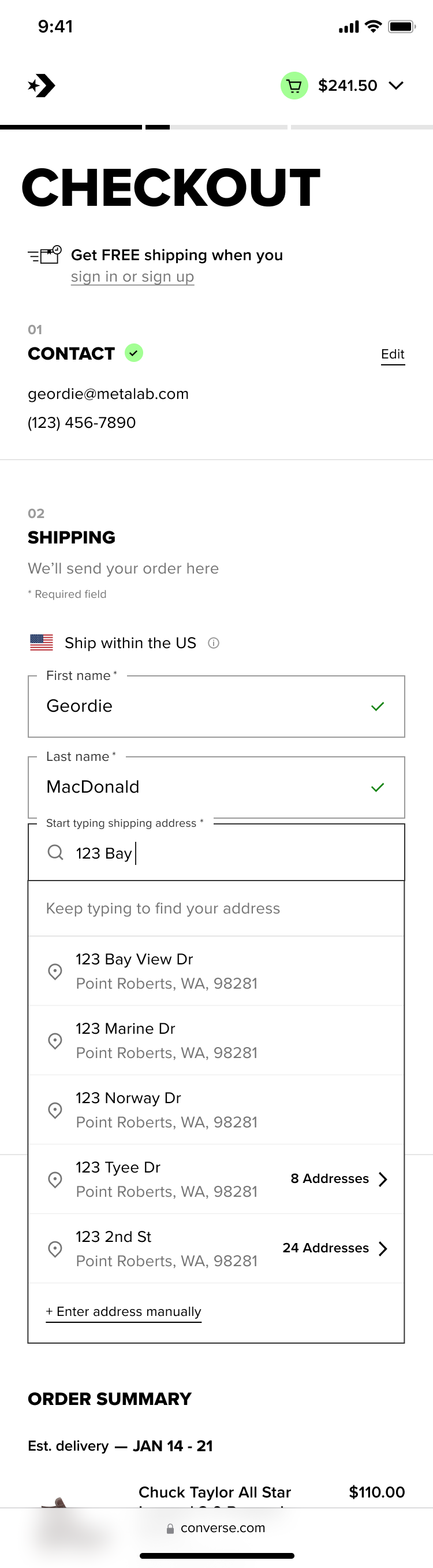
Leverage of Loqate–3rd party address predictive search and address validation capability, for easy form filling and error prevention
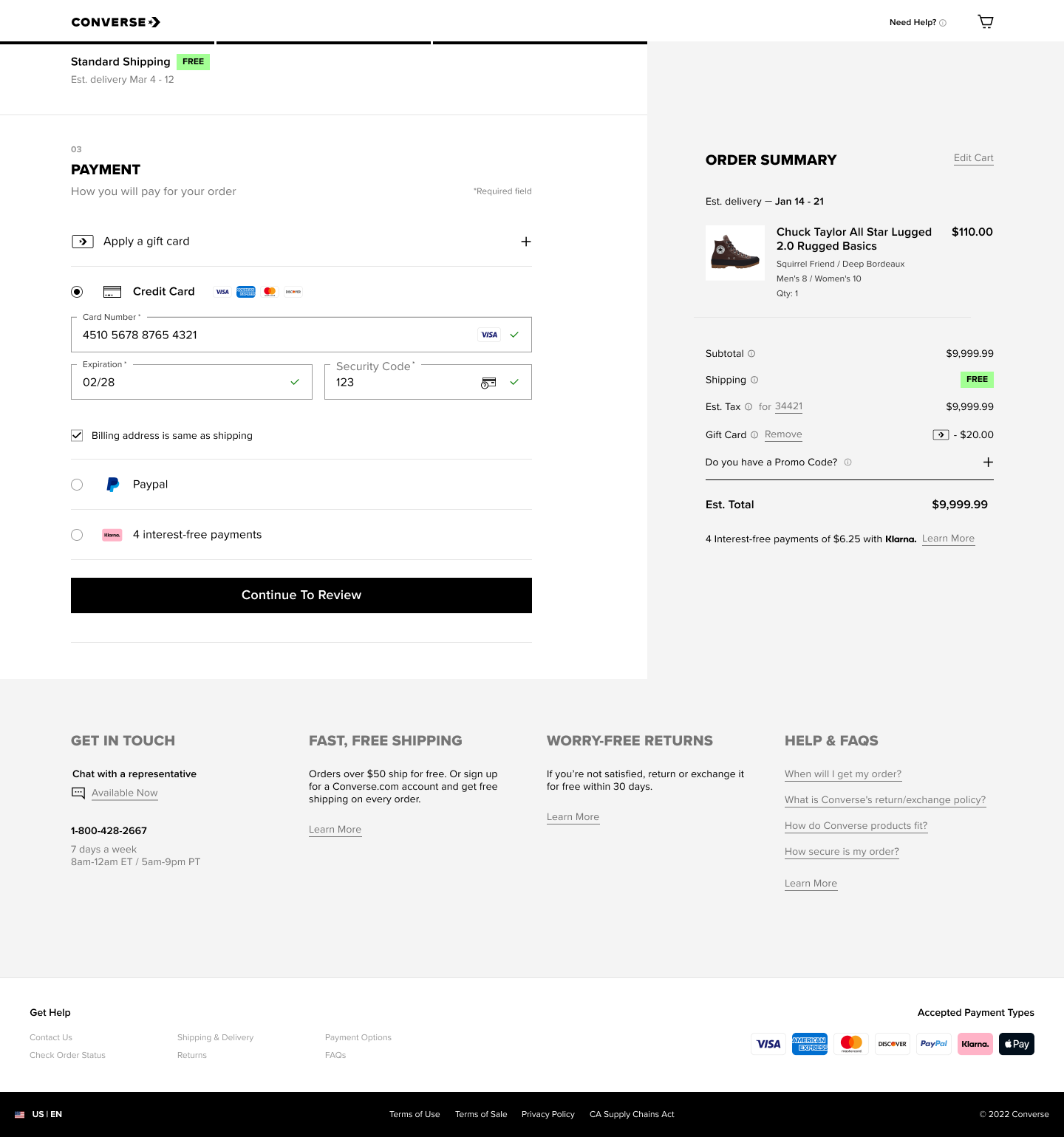
Re-Design:Checkout/ Shipping Step📦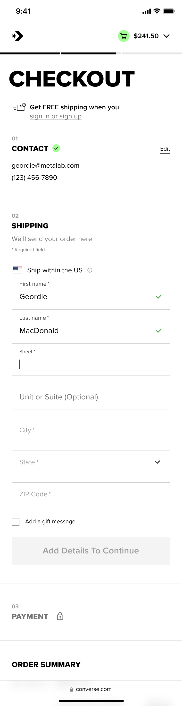
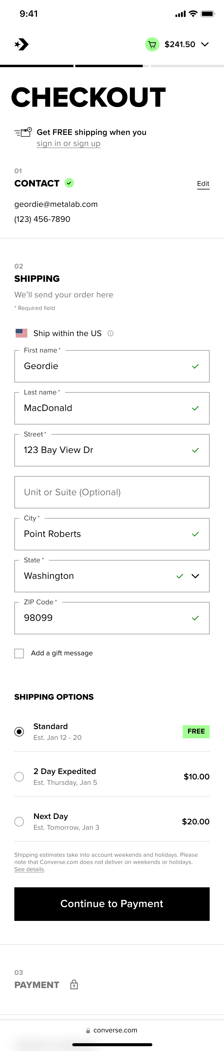
↘︎ Simplified Journey
Shipping Options only shows when it’s relevant
Defaulting to Standard as 85% of order completed with Standard shipping
Re-Design:Checkout/ Billing Step💰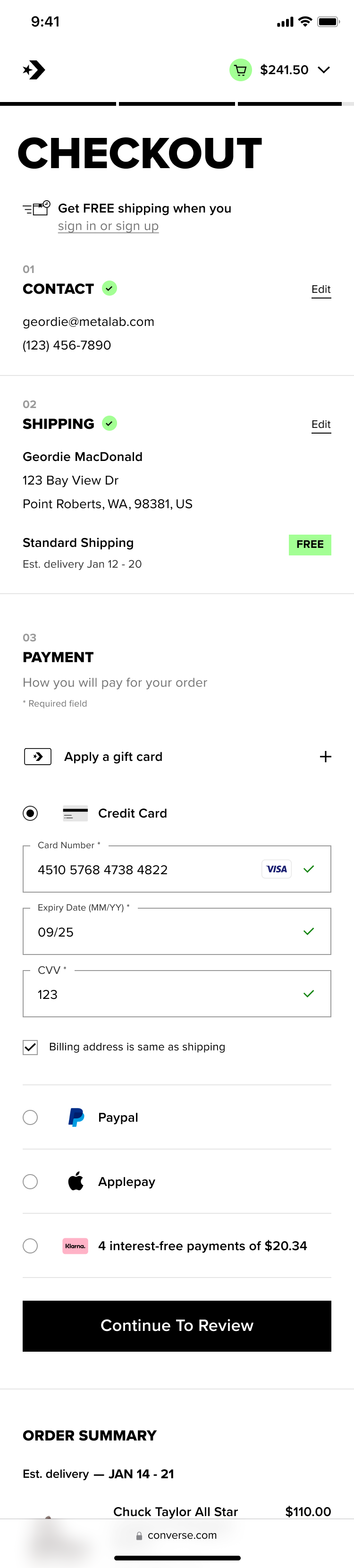
PrototypeHow was the
redesign launched?
Given the magnitude of changes introduced in the new Cart and Checkout experience, we adopted a phased, throttle rollout strategy to isolate the impact of key design decisions and ensure data clarity.
Rather than releasing all changes simultaneously, we structured a series of controlled experiments toevaluate how each shift influenced user behavior and business outcomes.
What were the controlled experiments?
Merchandising strategy: cart with upsell and cross-sell modules vs. without, to measure impact on average order value without harming conversion
Checkout structure: multi-page checkout vs. one-page progressive checkout, to understand the trade-off between perceived effort and cognitive load
Payment hierarchy: express pay options surfaced at the top of checkout vs. deferred placement, to reduce friction for high-intent users
Payment methods: availability of Apple Pay and Klarna in Western Europe sites vs. a baseline without them, to assess whether flexible and familiar payment options increase completion rates
Why?
Each variable was tested independently or in carefully designed combinations to minimize confounding factors. This approach allowed us to directly attribute changes in key metrics—such as conversion rate, average order value, and checkout completion time—to specific design decisions.
Quantitative & Qualitative
In parallel with these experiments, we conducted unmoderated user testing throughout the rollout to capture insights that quantitative data alone could not reveal. This included understanding users’ perception of speed and usability, identifying areas of friction or confusion, and measuring overall satisfaction with the experience.
We rolled out experiments incrementally across user segments, combining quantitative performance data with qualitative insights to validate improvements before scaling. This ensured that each iteration not only improved business metrics but also delivered a more intuitive and satisfying user experience.
Any post-launch optimization
your team did?
yes. Many.
Checkout optimization is an ongoing process, requiring continuous iteration based on user behavior and performance insights.
Following launch, we iterated on key friction points identified through analytics and user feedback, focusing on reducing checkout friction, improving completion rates across mobile, desktop, and returning user flows, and increasing units per transaction (UPT).