
CVS Pharmacy Homepage
As part of CVS Pharmacy’s brand refresh, the Marketing Team led an initiative to redesign and optimize the retail pharmacy homepage.
Project BackgroundMy InvolvementCross-functional Collaboration & Alignment
Knowledge transfer
Research share-out
Design share-out
Brand & copy verbiage alignment
Project roadmap creation & planning
Implementation plan & QA
Research & Data
Unmoderated user testings & A/B testings
Card-sort, nomenclatural study, tree-test
Design
Wire-framing
UX journey & strategy
Design mock-ups
Before: CVS Pharmacy Homepage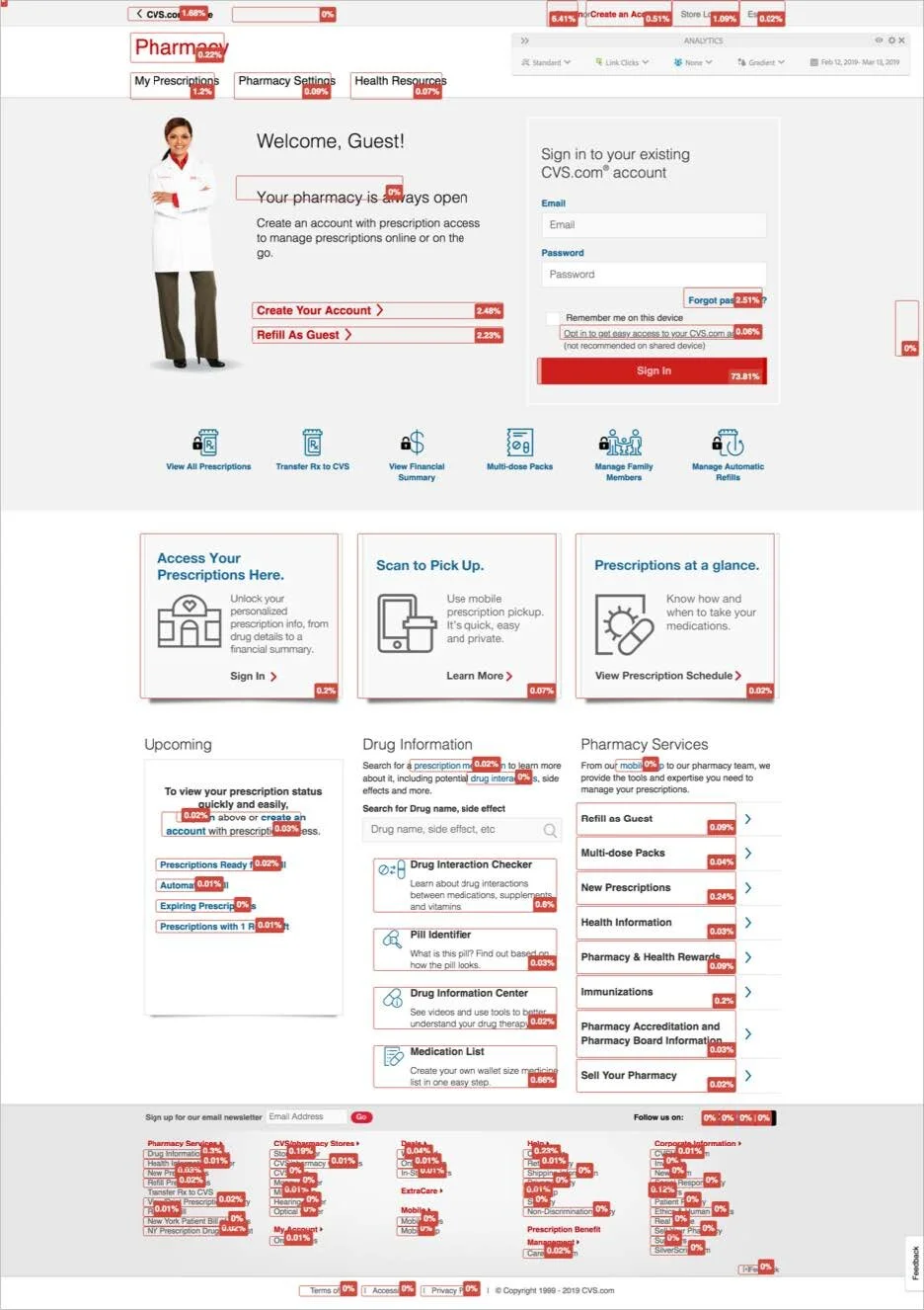
-
Homepage design does not aligned with new brand
Useful features and tools are under-utilized and presented
No presence of Marketing campaigns nor educational or information content
convoluting navigation and interaction
-
Product & service offering awareness
Streamline unauthenticated & authenticated pages
Set customer up for success with clear navigation, call to action and expectations
Accessibility & compliance and responsiveness
-
Boost customer engagement
Increase of account creation by 15%
Hub of landing pages, micro sites and campaigns
Concept Creation by External Agency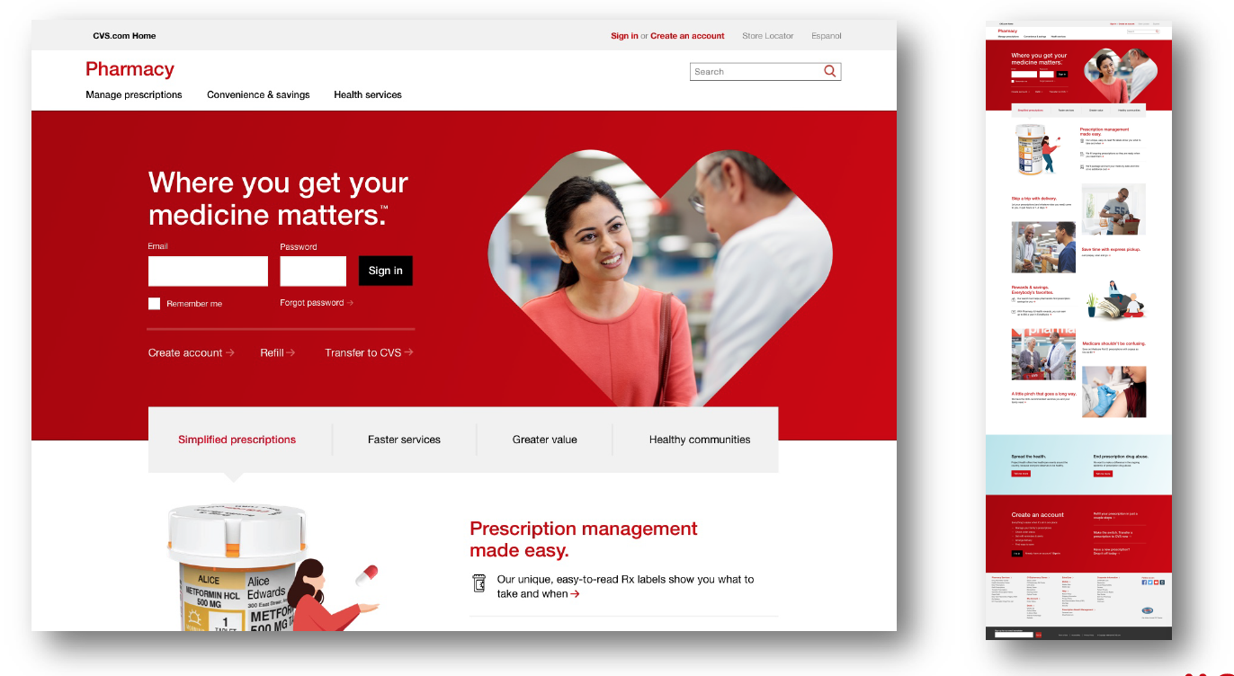
-
Navigation needs clear visual cue to imply clickability
With red background, error message to account sign in could experience challenges from both usability and implementation perspectives
Some of top primary tasks like Refill & Transfer to CVS could get lost
The anchor interaction to the gray utility bar has learning curve
Black text links didn’t look clickable and could lose engagement
Use of unfamiliar language require longer cognitive load from user’s end
Lack of a responsive mobile view
-
Participant enjoyed the new fresh look and thought the reds really popped and guided the eyes
Appreciated the imagery and use of iconography throughout
Longer content but overall easily understood
Final Mock Up
Final Mock Up

-
Primary tasks customer would engage were ”front and center” with clear visula cue on what’s clickable and not
Participants were successful in finding and accomplishing top tasks i.e. sign in, refill using various ways
Promo tiles were helpful at attracting attention to achieve marketing goals
Positive reaction to clean, simple layout, readability (large font and overall scan-ability) and attractiveness across all designs
Greater service awareness—participants were surprised at the range of services offered (e.g. delivery, simple dose pack)
Better hierarchy with use of consistent breadcrumb, clear CTA for next best actions
What's Next?Mobile Optimization
Ensure design is scalable and responsive
Sign-in to be within viewport
Secondary landing pages need to be mobile friendly
Further Engagement
Monitor desktop & mobile engagement to further optimization site
It’s More Than A Homepage
Ensure the authenticated, member’s experience is updated to not only carrie the same branding but also help guide members to complete task with ease